I have been repeatedly surprised to hear from many of my CEO executive coaching clients that, of all the many skills needed for the top job, one area where they often readily admit weakness is in financial insight. They rely on their accountants or a “numbers geek” to watch and even interpret company results. A fundamental reason for this blind spot is, I believe, that so many CEOs are highly visual, intuitive thinkers. Rows of precise digits are not their preferred form of communication. It is essential, therefore, to display financial and quantitative data visually to have it used and absorbed by these executives.
A second flaw in most of the financial data given to CEOs is its snapshot, isolated nature. People get to the top because of their vision over significant time periods. They use knowledge of the past to project into and create the future. Static, point-in-time measures are lifeless and nearly useless for them. These people need to see trends and changes over time.
T he easiest way to do this is a tool almost everyone already has: Microsoft Excel. I have provided links to the Excel workbooks I created for my clients. You can quickly create simple-to-maintain charts of your key performance indicators with the Excel workbooks linked to this page. Enter a few dozen historical revenue, profit, or non-financial numbers (proposals submitted, on-time deliveries, etc.) and the charts are generated for you. As you add a new column of data for each month the charts update automatically.
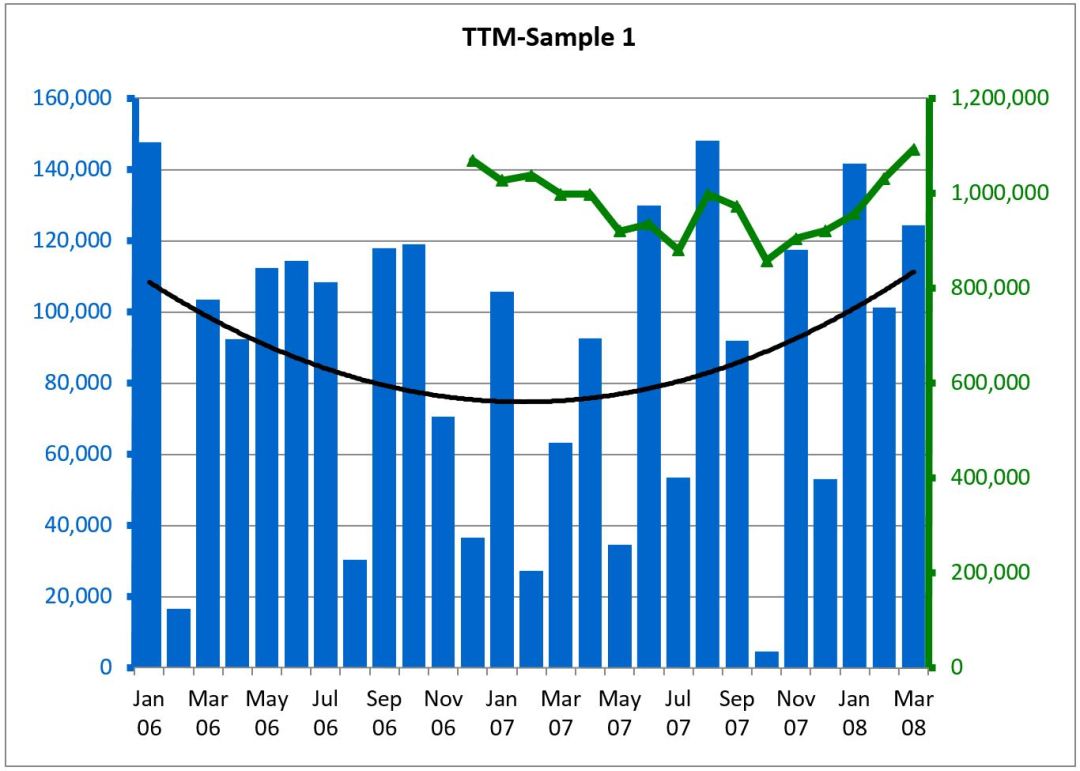
I have provided two Excel workbooks for you to download. One is for graphing and displaying your actual numbers. The second converts your numbers to an indexed format. The first period’s data is set to 100 and each succeeding period is plotted as a proportion of the first. This displays the same trends as the first workbook but keeps your specific numbers confidential, so you can use the charts with employees or colleagues. Both show a bar chart of each month’s results, a green line for the trailing twelve-month (TTM, i.e., the sum of the most recent twelve months), and a black line of a polynomial fit to the data.
Take a little time to get your numbers into one of these Excel workbooks and see what has been happening–so you can visualize your future.
NEW!
Click here for a new spreadsheet you can use to see the trends in your gross or net margin.
NEW!
See also Tony’s complete goal setting kit, with audio and workbook,
free on this blog.


Awesome!
Cheers for a great 2009!
pamela olson